Why Leadzai
For Agencies & CEOs
For CMOs & Marketing Leads
For Heads of Digital
How We Compare
The Leadzai Advantage™
See how we compare
Platform
Business model
Resources
Product News
Knowledge & Insights Hub
Knowledge Base
API Documentation
Leadzai June 2026 Product Release Roundup
About us
About Leadzai
Careers
Contact
Featured Vacancies
DJANGO Developer Intern
ML / AI Intern
REACT Developer Intern
Login
Login
Book a demo
Book a demo
Knowledge & Insights Hub
Curated industry insights and exclusive Leadzai intelligence.
Insight
May 19, 2026
Understanding Local Heroes: The SMB Mindset
Tara Nixon
-
Business Development Director
Understanding Local Heroes: The SMB Mindset
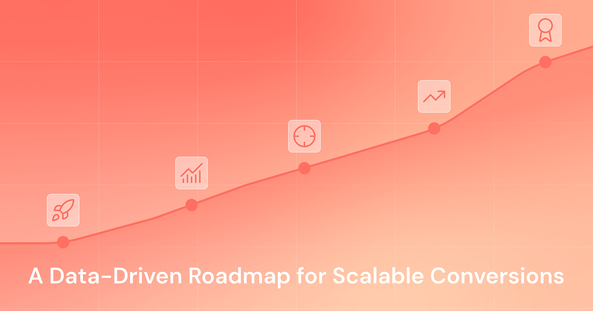
A Data-Driven Roadmap for Scalable Conversions
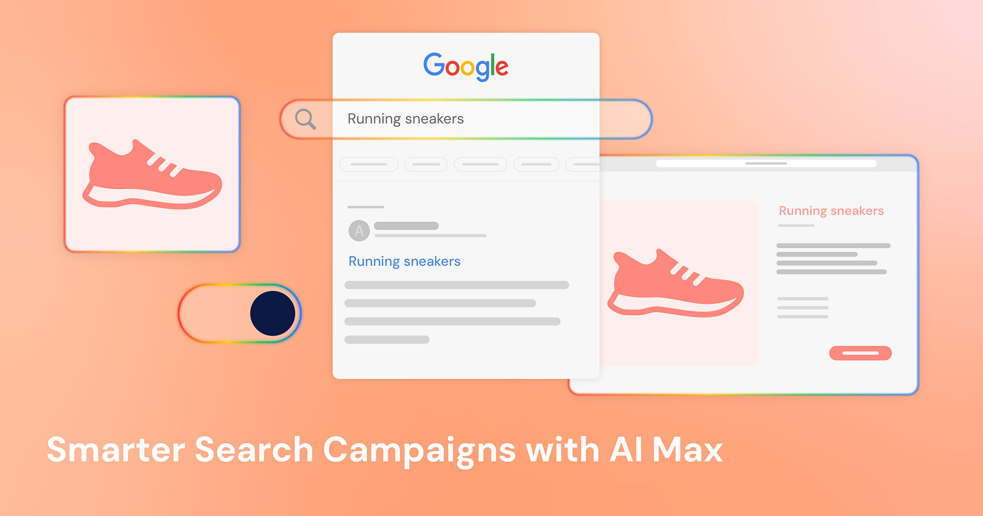
Smarter Search Campaigns with AI Max
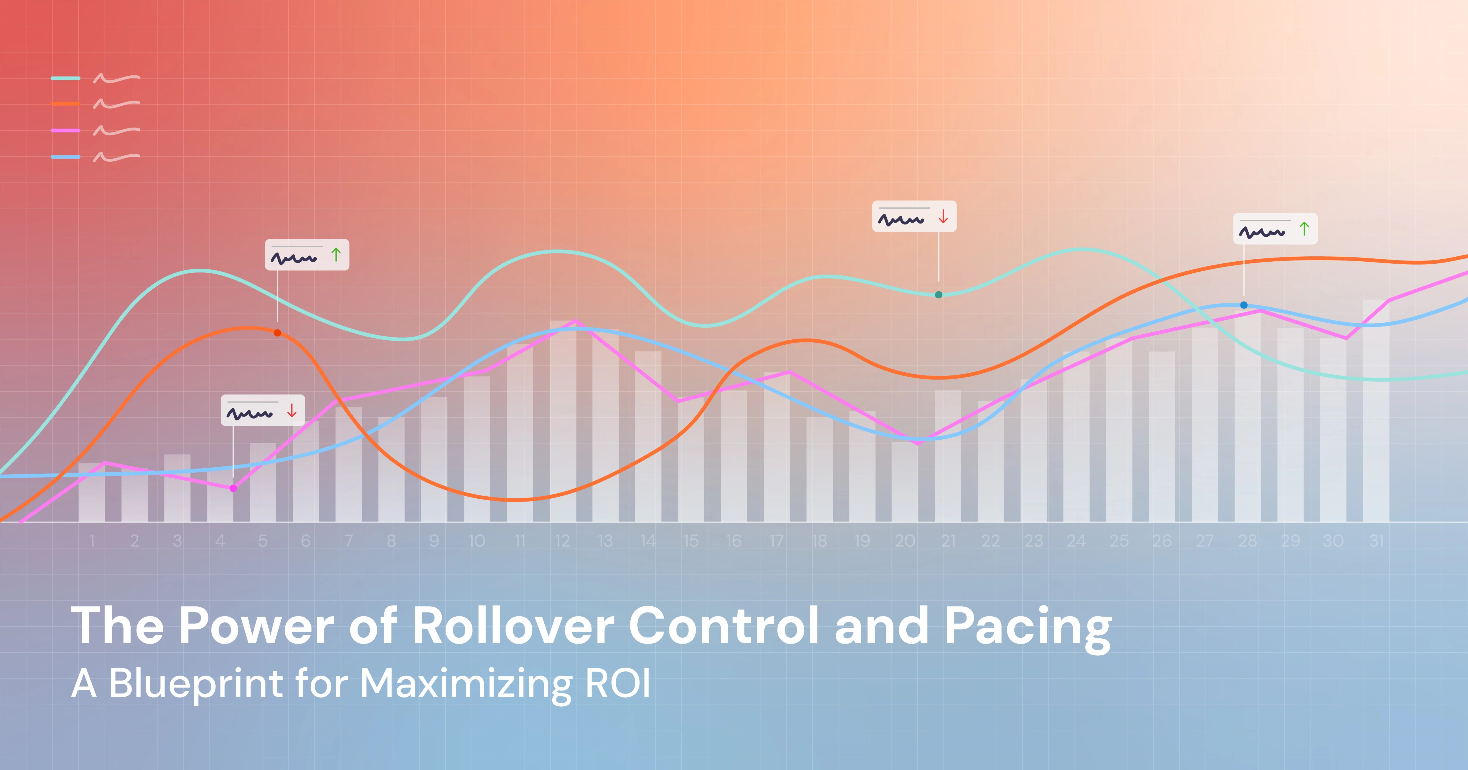
The Power of Rollover Control and Pacing: A Blueprint for Maximizing ROI
Text Link
This is some text inside of a div block.
This is some text inside of a div block.
This is some text inside of a div block.
Insight
December 7, 2025
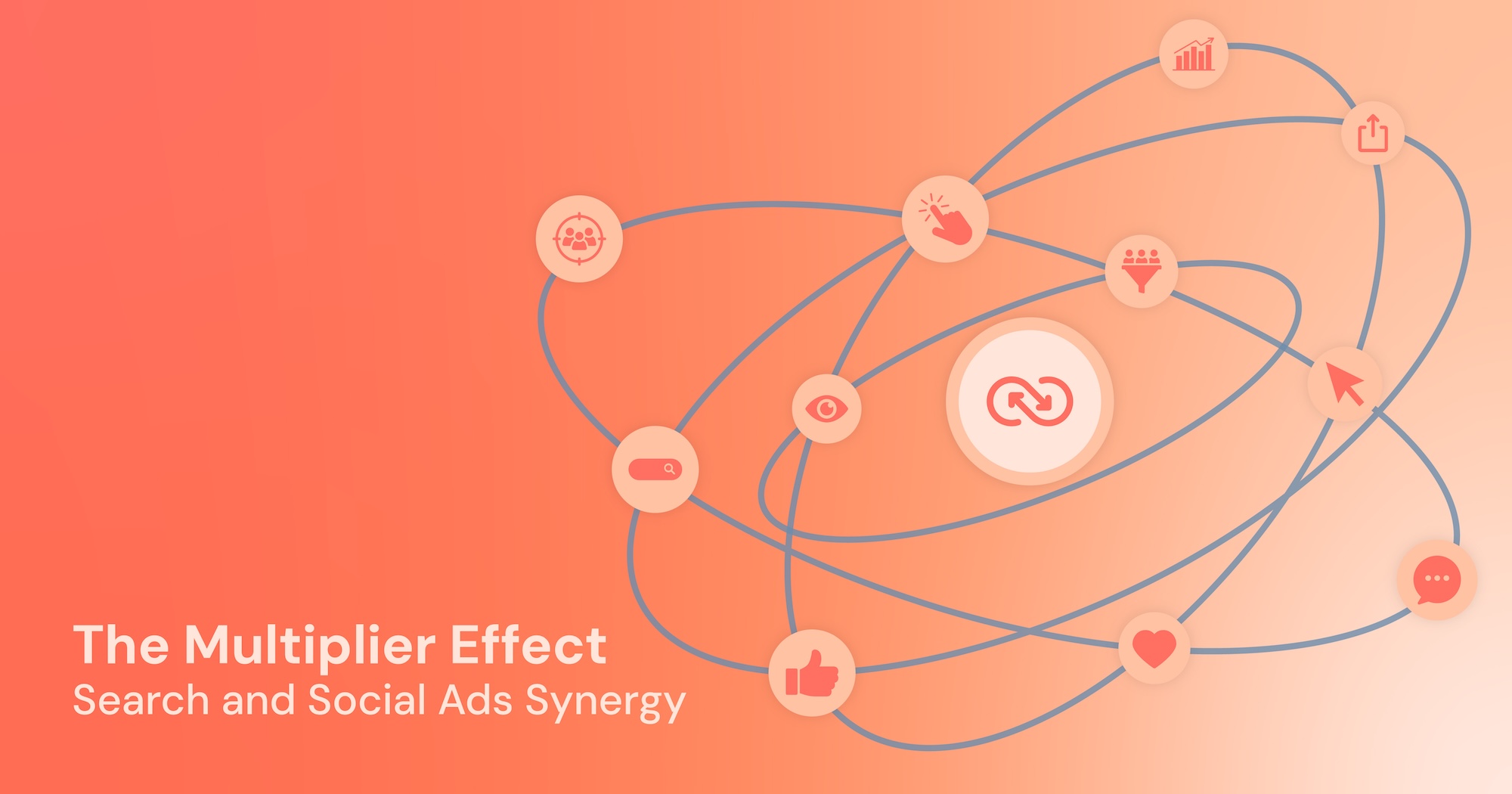
The Multiplier Effect: Unlocking Maximum Impact Through Search and Social Ads Synergy
This is some text inside of a div block.
One email. Big impact.
Smart ideas once a month. No spam. Ever.
Thank you! Your submission has been received!
Oops! Something went wrong while submitting the form.


.jpg)